Unit 3 Evaluation.
My photographic works of art question my emotional responses to the world and explore the idea of equivalents. I am interested in colour, texture and surface in my investigation of the importance of photography. Is it possible to make photographs that represent my state of mind and how might these be manipulated further to represent the ways in which thoughts and feelings are combined with visual information in the brain to make memories?
For my personal investigation I have been inspired by the Surrealists and their project to reshape how we see reality. They were amongst the first modern artists to become fascinated by photography and its ability to make instinctive and automatic images. One of the first themes I took on was the notion of chance, games and indeterminacy. I paired up with a classmate to make a game based on the idea of chance in photography. This game had to educate the players about a range of facts and general knowledge of photography. We had to show appropriate research, experimentation, and how we generated ideas. We had to be able to show that we could define our work effectively in order to develop it. There were a lot of factors in our game that were based on chance processes, for example, the numbers you roll on a die, the subject for the questions that you answer. The question cards were in a random order, the flashcards had either a bonus or a hazard which impacts on players progress with the game. The Surrealists were very interested in games, especially games that involved the element of chance. An example of this is the Exquisite Corpse. This is a collaborative drawing or writing game where two or more players generate a work of art by chance in a particular sequence. Chance plays a massive part in this game because you have no idea what the other players are drawing so it is near enough impossible to match the drawings together. The Surrealists enjoyed the process of making a drawing that is completely bizarre but still looking like a piece of art. The surrealists were interested in games because they liked the idea of not knowing the outcome at the end of the game, which is why they preferred experimenting with exquisite corpse as you had the mystery of not knowing how it would end up like.
When I played Exquisite Corpse I found it really appealing because you don’t have to be good at art or drawing to be able to play this game. You could draw something completely unconventional or draw something that is really detailed and captivating and both would be classed as art as that is how Surrealists see it. I created a photographic version of Exquisite Corpse using an app called ‘Andigraf’ on an iPod, a version of a multi lens toy camera enabling you to take a series of shots in sequence. Not only did I collaborate with another individual when doing this which allowed me to learn from them but I also followed and obeyed a certain set of instructions throughout the game whilst engaging with chance.
I then responded to Marcel Duchamp’s Three Standard Stoppages, creating a ‘new metre’. I called mine ‘subjective characterisation’ because I measured my own width and height. I liked this name because no one is the same, no one has the same characteristics as you. Next, I gathered dust from my vacuum cleaner as well as the hair from a hair brush. Dust is dead skin cells, hair strands from your family that live in the same house as you, and fur from pets. I made a series of photograms using these materials, experimenting with putting the hair in the lens of the enlarger and messing around with the focus. The photograms improved the more I made as I was able to time the exposures with experience. As disgusting as I found the idea of using dead skin cells and dirt I found the whole idea quite interesting because the photograms that I made were like a weird family portrait.I then explored the notion of ‘equivalents’ and Alfred Stieglitz’ photographs of clouds. These were abstract and he referred to them as ‘equivalents’ of his own memories, thoughts, emotions as well as past experiences. I decided to take three sets of images based on the notion of equivalents. Firstly, I took photos of things that caught my eye. In the second photoshoot I took photos that represented the emotion I was feeling at that exact moment. Finally, in the last photoshoot I took photos by chance, I learnt that you don’t need to plan photos for them to be effective, you don’t even need to spend ages on finding the perfect angle or the perfect lighting for your images to be appealing.
I became interested in the idea of sequences and the work of John Baldessari. He threw four orange balls in the air and took 36 photos of the journey that the balls took while they were in the air. He made similar experiments with other objects - carrots, clouds etc. I chose to photograph a sequence of shoes. I lay three shoes on the floor and a classmate rolled the dice, pointing to the relevant shoe. If it was over three we would count backwards, but we would replace that shoe with a spare one. I repeated this 15 times and took a photo of each transaction. As I did I noticed that the lighting wasn’t that great so I re-took the images inside and placed white paper under the shoes. I also refined the angle of the camera so that the images I made were more objective and scientific.
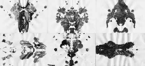
I then did some research about The Rorschach Inkblot Test which consists of 10 inkblots printed on cards, originally five in black and white, five in colour, created in 1921. I have always found psychology interesting and I was interested in the relationship between photographs and the mind. To what extent do we control our thoughts and feelings? Is it possible to photograph instinctively? How can photographs represent our thoughts and feelings? I created half a dozen of my own Rorschach inkblots and scanned them onto the computer so I could edit them on Photoshop. I selected the black part (the ink blot) and replaced it with another image that I took from the equivalents series. I left half of the final images in colour and converted the other half into black and white. I finally decided that all the images should be in black and white, emphasising their abstract qualities. I decided to use these as a resolved outcome and have presented them in frames. I am very happy with the final outcome.
For my personal investigation I have been inspired by the Surrealists and their project to reshape how we see reality. They were amongst the first modern artists to become fascinated by photography and its ability to make instinctive and automatic images. One of the first themes I took on was the notion of chance, games and indeterminacy. I paired up with a classmate to make a game based on the idea of chance in photography. This game had to educate the players about a range of facts and general knowledge of photography. We had to show appropriate research, experimentation, and how we generated ideas. We had to be able to show that we could define our work effectively in order to develop it. There were a lot of factors in our game that were based on chance processes, for example, the numbers you roll on a die, the subject for the questions that you answer. The question cards were in a random order, the flashcards had either a bonus or a hazard which impacts on players progress with the game. The Surrealists were very interested in games, especially games that involved the element of chance. An example of this is the Exquisite Corpse. This is a collaborative drawing or writing game where two or more players generate a work of art by chance in a particular sequence. Chance plays a massive part in this game because you have no idea what the other players are drawing so it is near enough impossible to match the drawings together. The Surrealists enjoyed the process of making a drawing that is completely bizarre but still looking like a piece of art. The surrealists were interested in games because they liked the idea of not knowing the outcome at the end of the game, which is why they preferred experimenting with exquisite corpse as you had the mystery of not knowing how it would end up like.
When I played Exquisite Corpse I found it really appealing because you don’t have to be good at art or drawing to be able to play this game. You could draw something completely unconventional or draw something that is really detailed and captivating and both would be classed as art as that is how Surrealists see it. I created a photographic version of Exquisite Corpse using an app called ‘Andigraf’ on an iPod, a version of a multi lens toy camera enabling you to take a series of shots in sequence. Not only did I collaborate with another individual when doing this which allowed me to learn from them but I also followed and obeyed a certain set of instructions throughout the game whilst engaging with chance.
I then responded to Marcel Duchamp’s Three Standard Stoppages, creating a ‘new metre’. I called mine ‘subjective characterisation’ because I measured my own width and height. I liked this name because no one is the same, no one has the same characteristics as you. Next, I gathered dust from my vacuum cleaner as well as the hair from a hair brush. Dust is dead skin cells, hair strands from your family that live in the same house as you, and fur from pets. I made a series of photograms using these materials, experimenting with putting the hair in the lens of the enlarger and messing around with the focus. The photograms improved the more I made as I was able to time the exposures with experience. As disgusting as I found the idea of using dead skin cells and dirt I found the whole idea quite interesting because the photograms that I made were like a weird family portrait.I then explored the notion of ‘equivalents’ and Alfred Stieglitz’ photographs of clouds. These were abstract and he referred to them as ‘equivalents’ of his own memories, thoughts, emotions as well as past experiences. I decided to take three sets of images based on the notion of equivalents. Firstly, I took photos of things that caught my eye. In the second photoshoot I took photos that represented the emotion I was feeling at that exact moment. Finally, in the last photoshoot I took photos by chance, I learnt that you don’t need to plan photos for them to be effective, you don’t even need to spend ages on finding the perfect angle or the perfect lighting for your images to be appealing.
I became interested in the idea of sequences and the work of John Baldessari. He threw four orange balls in the air and took 36 photos of the journey that the balls took while they were in the air. He made similar experiments with other objects - carrots, clouds etc. I chose to photograph a sequence of shoes. I lay three shoes on the floor and a classmate rolled the dice, pointing to the relevant shoe. If it was over three we would count backwards, but we would replace that shoe with a spare one. I repeated this 15 times and took a photo of each transaction. As I did I noticed that the lighting wasn’t that great so I re-took the images inside and placed white paper under the shoes. I also refined the angle of the camera so that the images I made were more objective and scientific.
I then did some research about The Rorschach Inkblot Test which consists of 10 inkblots printed on cards, originally five in black and white, five in colour, created in 1921. I have always found psychology interesting and I was interested in the relationship between photographs and the mind. To what extent do we control our thoughts and feelings? Is it possible to photograph instinctively? How can photographs represent our thoughts and feelings? I created half a dozen of my own Rorschach inkblots and scanned them onto the computer so I could edit them on Photoshop. I selected the black part (the ink blot) and replaced it with another image that I took from the equivalents series. I left half of the final images in colour and converted the other half into black and white. I finally decided that all the images should be in black and white, emphasising their abstract qualities. I decided to use these as a resolved outcome and have presented them in frames. I am very happy with the final outcome.
|
I became interested in the Surrealist idea of “convulsive beauty”. “Beauty will be convulsive or not at all… Convulsive beauty will be veiled-erotic, fixed-explosive, magic-circumstantial or not at all.. - Andre Breton. I then began by experimenting with colour, choosing to spend a week photographing objects of only this colour. Once I did this, a range of different ideas began to connect to each other. I then did some research about The Rorschach Inkblot Test which consists of 10 inkblots printed on cards, originally five in black and white, five in colour, created in 1921.
|
I have always found psychology interesting and I was interested in the relationship between photographs and the mind. To what extent do we control our thoughts and feelings? Is it possible to photograph instinctively? How can photographs represent our thoughts and feelings? I created half a dozen of my own Rorschach inkblots and scanned them onto the computer so I could edit them on Photoshop. I selected the black part (the ink blot) and replaced it with another image that I took from the equivalents series. I left half of the final images in colour and converted the other half into black and white. I finally decided that all the images should be in black and white, emphasising their abstract qualities. I decided to use these as a resolved outcome and have presented them in frames. I am very happy with the final outcome.
The main idea that I had was to take unplanned images and to pick out the colour blue in each image. I began to tear blue sections out of a range of photographs, creating some really interesting shapes and textures. I then looked at the work of Sarah Sze who makes installations using photographs and other objects. They look like disassembled collages. I felt as though Sze’s work corresponded with what I was doing with mine. I wanted to make an installation like this. I could use other materials such as cardboard, wood, magazines, and fabric etc. and just keep adding different layers and textures to make a loose collage. While making this loose collage I was rephotographing as I went along to capture the process. I took photos from different angles and perspectives so it wasn’t clear what you were looking at in the image and then I took some more straightforward, documentary images. I printed all of the images onto a contact sheet which I colour coded depending on the quality of the images.
The main idea that I had was to take unplanned images and to pick out the colour blue in each image. I began to tear blue sections out of a range of photographs, creating some really interesting shapes and textures. I then looked at the work of Sarah Sze who makes installations using photographs and other objects. They look like disassembled collages. I felt as though Sze’s work corresponded with what I was doing with mine. I wanted to make an installation like this. I could use other materials such as cardboard, wood, magazines, and fabric etc. and just keep adding different layers and textures to make a loose collage. While making this loose collage I was rephotographing as I went along to capture the process. I took photos from different angles and perspectives so it wasn’t clear what you were looking at in the image and then I took some more straightforward, documentary images. I printed all of the images onto a contact sheet which I colour coded depending on the quality of the images.
|
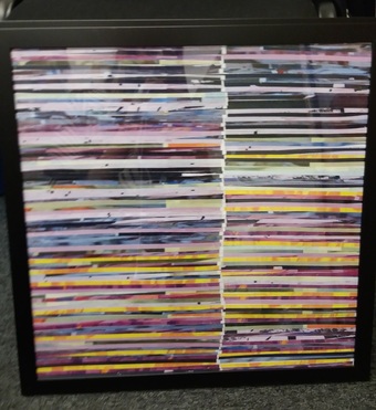
I then discovered the work of Joachim Schmid. One of Schmid’s images appealed to me specifically. It was made up of what looked like shredded magazines. I printed out 30 of my best photographs and shredded them, sticking them onto board. I photographed the outcome and edited the images in TextEdit to produce glitched versions of the already scrambled images. I typed random words and letters into the jpeg code, removed parts and pasted other sections so it was completely mixed up and there was a range of different bright colours that I could use for the next shredded piece. I repeated the exact same process again and the result was much more effective than the original version. I felt as though this process links in with the equivalents as the colours that come out in the glitched images may represent your emotions, for example, if there was a lot of red in the image it could represent anger, a lot of yellow could represent happiness, blue could represent sadness and so on; on the other hand to another person it could just simply be a process of experiments that resulted in pure abstraction due to chance.
|
After this outcome I came to the conclusion that there wasn’t much more that I could do with this particular process, so I decided to pursue my interest in colour and its relationship to emotion influenced by Keith Arnatt’s images of rubbish. He took photographs of rotting food from a rubbish tip. Arnatt believes that by taking these images in this perspective it would make the view feel like they were in the same position as him when he first noticed and picked up the mouldy food. He photographed the images so close up in an angle where the bag reflects the light so it would conceal the context of the photos so the subject of the image isn’t unidentifiable, it left a bit of mystery in the photos. Normally you wouldn’t look twice at this subject whereas Arnatt photographed it as if it was beautiful. In this way, the discarded, mouldy food items can be seen as objects of beauty when presented in a different setting, especially when using framing techniques, colour and lighting and that enhance the visual appeal of the images. - Keith Arnatt. On the other hand, Mandy Barker photographed not only recycled objects but objects found washed up on a beach and just general rubbish on the streets. Barker distributed the objects in quite a random way, but after separating them into categories such as footballs, plastic objects, and objects found on a beach etc. I wanted to try both approaches. The one criticism I have about the series of photographs I took of food is that they look too neat, as though I spent too long thinking about the precision of the images. They needed to be more chaotic in terms of the compositions.
In response to Barker’s work I decided to lay out objects on a concrete floor. I liked this idea as it was more natural, whereas a white background would have looked really fake and unnatural. I also put the objects in colour order. I photographed everything together then I photographed the colour groups separately. I also experimented with used a macro lens to photograph rubbish around the school. I continued to explore using brightly coloured paper, a clear/partially transparent plastic bag and a camera with a macro lens. I decided to do this photoshoot in the corridor by a big window so I had natural light. I liked the combination of the translucent bag containing an assortment of other objects which were just visible. The macro lens enabled me to create close-up abstractions.
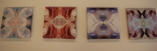
After looking at these images I decided to make this into a final piece but they needed to be refined a lot to make them more interesting before I thought of ways of presenting them. I decided to use photoshop to edit them, I chose to edit 15 of the images and I chose four of the best to make into a final piece. I transferred the images onto canvases on photobox; some people could say that these edited images looked like Alfred Stieglitz and Francis Picabia’s equivalents because the way some of the images have been edited a couple of them could be seen as angry expressions as the dimensions in the chosen four are really sharp and clear so you could look into the images and see emotions. The chose a range of different colours such as light blue, dark blue, light green, dark green, pink, orange and yellow; I chose these range of colours because I wasn’t sure whether some of the colours would come through the plastic bag or whether they would come out clear through the camera like the yellow and the darker colours, the colours that came through the most were the vibrant colours which were orange, pink, light blue; These colours could represent happiness, however, the dark blue colour came out with quite an interesting effect, it came out with purple tones in it as shown below.
In response to Barker’s work I decided to lay out objects on a concrete floor. I liked this idea as it was more natural, whereas a white background would have looked really fake and unnatural. I also put the objects in colour order. I photographed everything together then I photographed the colour groups separately. I also experimented with used a macro lens to photograph rubbish around the school. I continued to explore using brightly coloured paper, a clear/partially transparent plastic bag and a camera with a macro lens. I decided to do this photoshoot in the corridor by a big window so I had natural light. I liked the combination of the translucent bag containing an assortment of other objects which were just visible. The macro lens enabled me to create close-up abstractions.
After looking at these images I decided to make this into a final piece but they needed to be refined a lot to make them more interesting before I thought of ways of presenting them. I decided to use photoshop to edit them, I chose to edit 15 of the images and I chose four of the best to make into a final piece. I transferred the images onto canvases on photobox; some people could say that these edited images looked like Alfred Stieglitz and Francis Picabia’s equivalents because the way some of the images have been edited a couple of them could be seen as angry expressions as the dimensions in the chosen four are really sharp and clear so you could look into the images and see emotions. The chose a range of different colours such as light blue, dark blue, light green, dark green, pink, orange and yellow; I chose these range of colours because I wasn’t sure whether some of the colours would come through the plastic bag or whether they would come out clear through the camera like the yellow and the darker colours, the colours that came through the most were the vibrant colours which were orange, pink, light blue; These colours could represent happiness, however, the dark blue colour came out with quite an interesting effect, it came out with purple tones in it as shown below.
|
I was very happy with the final outcome with the canvases, this is because the images were originally quite absurd, looking at them you would have no idea what they were, added to that, the texture of the images on the canvases felt like and reminded me of skin in a way and that just added to the absurdity. Over this unit I have learned how important photography was to surrealists, they always have a meaning behind the photos that they take, they don’t necessarily go out of their way to take good photos and that is what makes the images surreal and absurd.
|
