Personal Project 1
To start my personal project I completed two mind maps, the first one had all of the options which I could choose from to base what my personal project should be on. The options are figures, abstraction, objects, and places. I then mind mapped around these genres of things that they could involve. For example, For places you could contrast inside to outside, rich to poor, urban to rural etc, for abstraction you focus on surfaces, layers, edges, and textures (contrasting rough and soft etc). Objects is another genre where I could cover collections, natural form which could contrast against man made form, another contrast could be order and chaos, multiple and singular etc. The last genre is figures, which could contrast happy and sad, movement and stationary, order and disorder and life and death. For each of these I can find some photographers that are relevant to each genre. For example, for figures the photographers I could look at Diane Arbus, Francesca Woodman, Stephan Pipin, Steven Shanabrook. One of my favourite photographers that relate to abstract photography is Aaron Siskind.
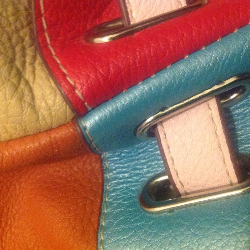
Out of all of these genres/themes I chose a sub-theme which is objects. I then based my second mind map on this, i listed things such as:
Out of all of these genres/themes I chose a sub-theme which is objects. I then based my second mind map on this, i listed things such as:
- order - chaos - compact - space
- natural form - flowers - wildlife
- man-made - artificial - synthetic
- collection - groups - individual - repetition - typology
- shapes - organic - geometric
Quotes that inspire my idea.
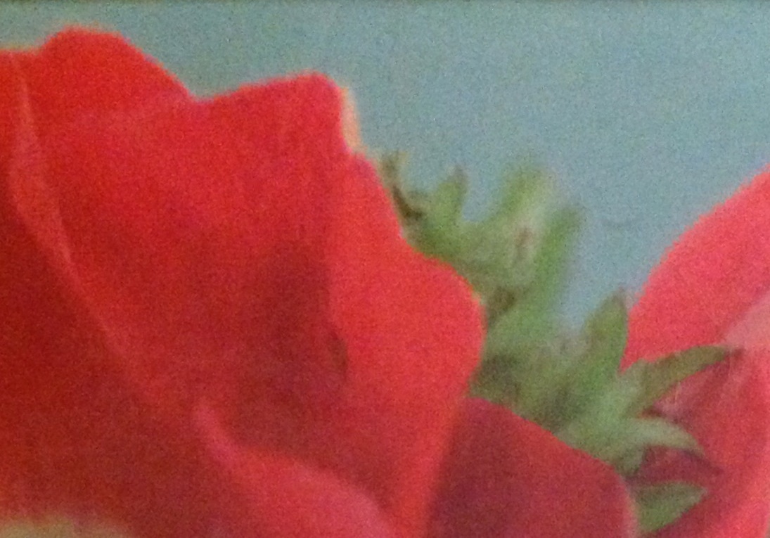
'Look deep into nature, and then you'll understand everything better' - I really like this quote because most people never put the effort in to look beyond what most people think is are 'weeds' when there is so much more beauty involved in wildlife and nature that not many people notice.
'What would be ugly in a garden constitutes beauty in a mountain.' - I love this quote, I believe that this quote is so true as like I said some parts of nature people think is ugly but I believe that everything is beautiful in its own way. Obviously if a weed or a half dead flower is growing next to a big rose, everyone would agree that the rose is more beautiful but if it you look at it in a different perspective you may see the beauty in the dead flower as it was once a beautiful flower like the rose.
'We do not see nature with our eyes, but with out understandings and our hearts' - I think this quote is so true because if you just look at nature without having full understanding of what nature truly is you will never actually see the beauty of it.
Research.
The two photographers that I believe link to my idea of objects are Jan Groover and Jaroslav Rossler as they both demonstrate quite a lot of geometric forms. Both of these photographers work is quite abstract yet has many geometric shapes in them which is what I like about them.
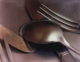
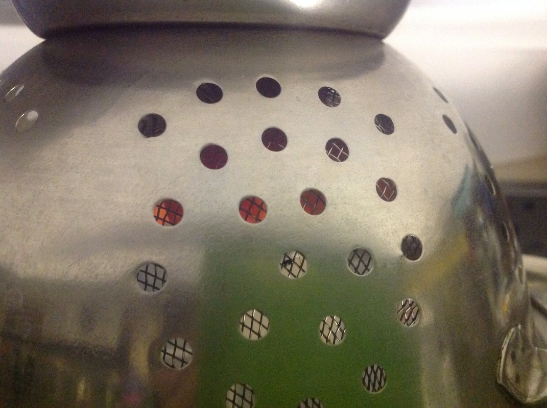
Jan Groover
I really like Jan Groovers work because it is abstract yet quite geometric. I like the idea of Groover using kitchen utensils and cutlery as a subject as eventhough they are quite simple they look really good in different perspectives and focuses etc. Below are some examples of her work.


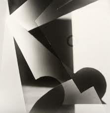
Jaroslav Rossler
I am also a fan of Rosslers work as like Jan groover it is quite abstract yet it is extremely geometric. Jaroslav Rossler mainly works with black and white photos, its almost as if they are photograms. They really outline the idea of formal elements as they are various shapes, lines, shadows, etc. Below are some examples of Rosslers work.


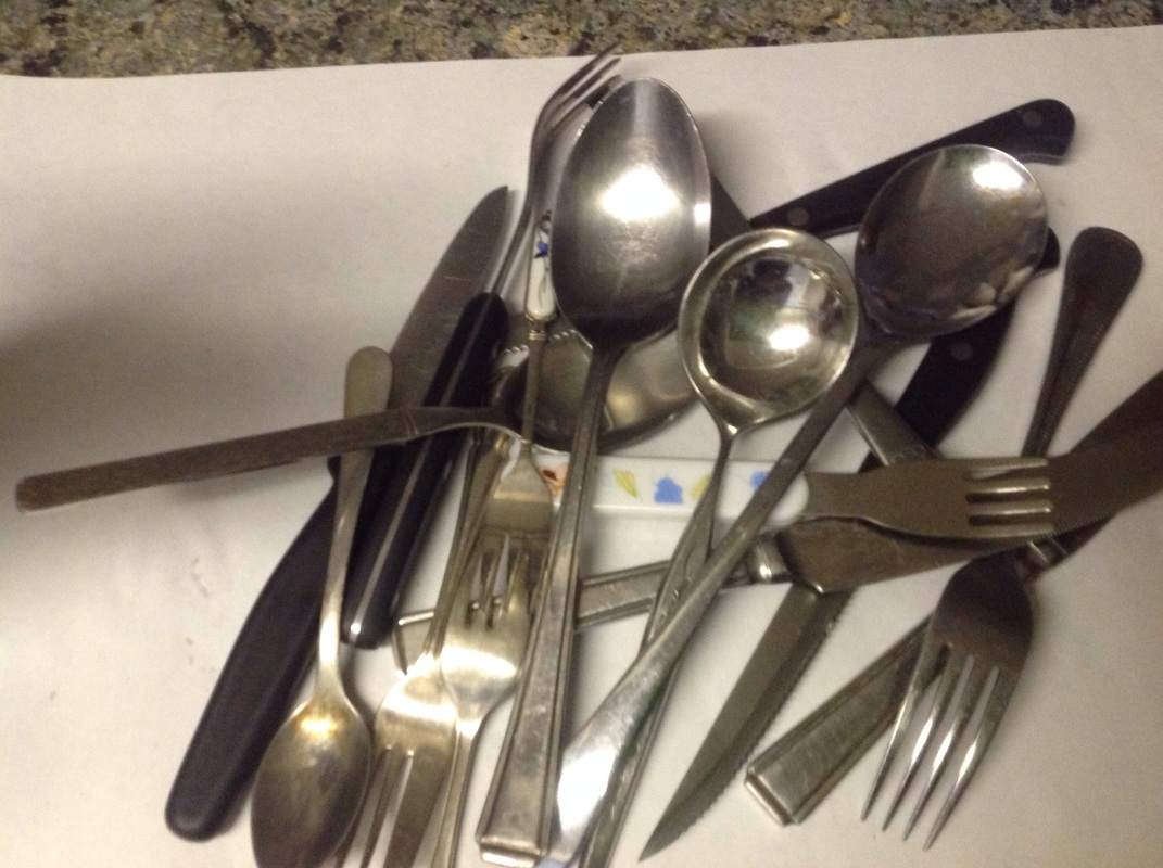
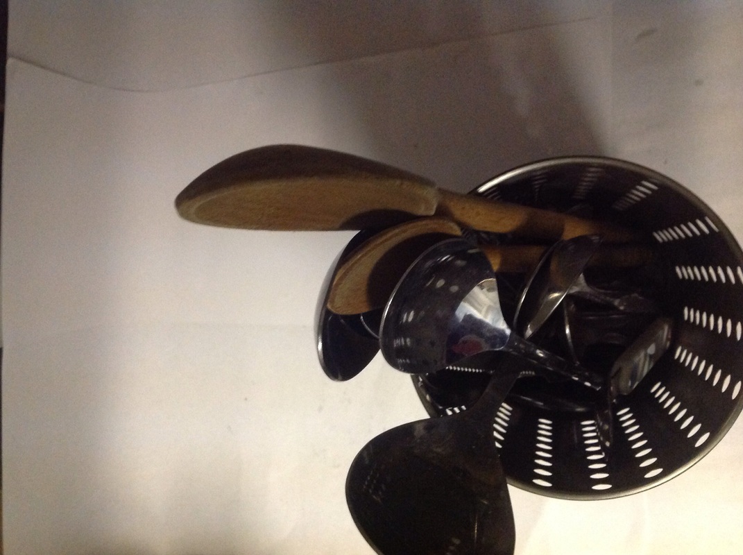
The next step is to create my own take on Groovers and Rosslers work, for Groovers work I am using kitchen utensils but I will be taking them in different perspectives, I will also experiment with light, focus, pattern, colour and shadow in these photos, I want to make this set of images quite abstract. However my take of Rosslers photos will involve creating photograms using geometric shapes.


The original final piece
Refining and Re-photographing


refined photoshopped images.


Evaluation.
AO1: Researching and generating ideas
AO2: experimenting and refining
AO3: recording and designing
AO4: responding and evaluating.
AO1:
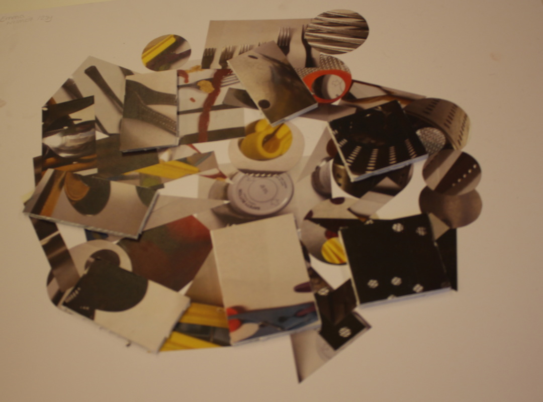
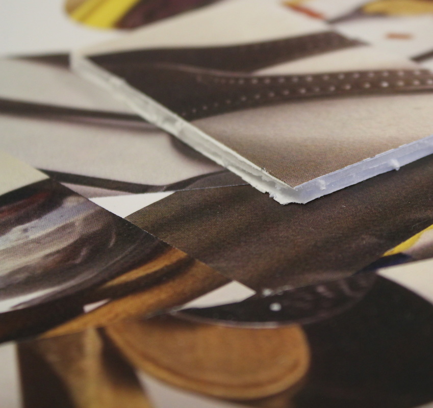
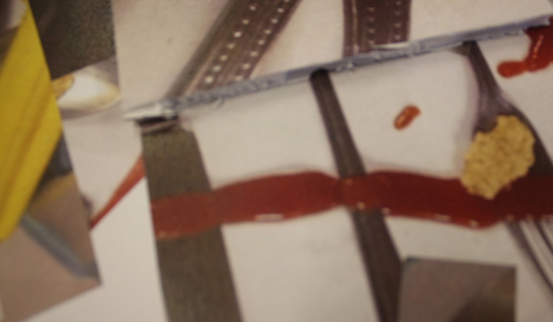
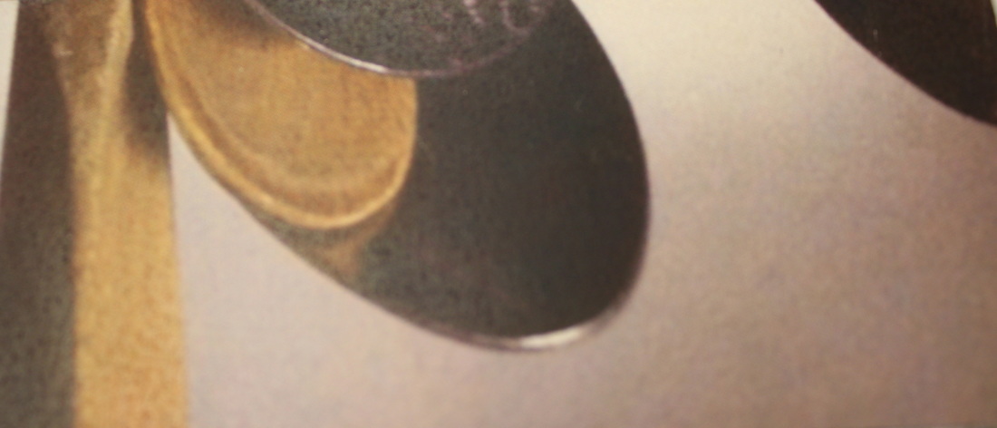
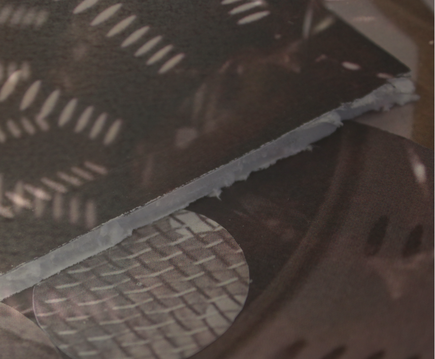
I first started this final piece by choosing a sub-theme which was objects, I then started to list things that linked to this theme. My first idea was to create a collage mixed between photograms and just normal photographs as I looked at Jan groovers work as well as Jaroslav Rosslers; however after I took my first photoshoot based on Groovers work I decided I would just use that set of images instead of photograms aswell but make my work comparative in a different way; I wanted to create abstract photos but to cut them into geometric shapes as those two forms are comparative, I still decided to keep the presentation idea the same which was a collage.
AO2:
At the start I tried experimenting with different shapes for my photograms, I started drawing around different objects to create these shapes I then cut them out to use in my photograms, however, as the cartridge paper was quite thin, it did not exactly create a clear outline of the shapes, plus the people that where using the chemicals behind hand had put something in it to create a scratchy effect to the photograms itself weren't clear either. After I decided that I would drop the idea of photograms and just continue to base my work upon Jan groovers' I created the first take on her photos which are shown above. I decided that there was no need to take any more of these photos as this photo shoot was quite large, by this I mean that there was a lot of photos and uploading these would take a long while by itself, they would also take up a lot of space on my website too. After this I found objects that created some geometric shapes that I could draw around, some of these objects was a round paint tub, a square and circular pieces of wood, a triangular angle measurer, etc and I then started to cut them out. However the shapes were not very straight our accurate so the shapes with the straight edge I trimmed with the trimmer to make them entirely straight and with the circular shapes I used a compass to draw around them again so by that point the shapes were precise and accurate. After that step I had to layout the collage to get a slight idea of how I would like it to look; After creating my final piece using a standing knife, spray mount, foam board and mount board I then realised that the how collage was reasonably good apart from the fact that the cutting of the foam board wasn't that accurate but I thought it was quite good considering it was the first time I attempted to cut foam board and mount board etc, however this problem could be the start of my second final piece due to me having a brief idea of how I could refine it; the idea I have is to experiment with focus, angle, perspective and distance with with a camera on my first final piece to create new images, I do not know exactly how I could lay it out yet but that is a brief outline of what the idea is.
AO3:
All throughout this process I recorded my ideas and inspiration on this website, even though some of my ideas changed I still kept the quotes the same as it is part of my first idea, it shows the development in my ideas so I just decided to keep everything the same and then state what I changed in this evaluation as it is all part of the process to make the final piece better. I enjoy creating collages so that is the reason I decided to create one for my final piece, however a 2D collage is actually quite boring so I decided to make it more 3D by using foam board to mount on top of the collage, I tried choosing the most interesting photos to be mounted on foam board.
AO4:
After I finished I didn't think that my work was up to a high enough standard so I decided to refine this piece and re-photograph it close up and I took around 50 of these sort of photographs and I uploaded them all to my computer and put them into photoshop, I chose two images to start with that I thought would go together well, I blended two of the photos together and changed to opacity of them, I did this 7 times, I then darkened all of the blended images and printed them out, I then went to a shop after school and bought a pack of magnets and the final idea was photographing them stuck onto metal magnetic trays.
AO2: experimenting and refining
AO3: recording and designing
AO4: responding and evaluating.
AO1:
I first started this final piece by choosing a sub-theme which was objects, I then started to list things that linked to this theme. My first idea was to create a collage mixed between photograms and just normal photographs as I looked at Jan groovers work as well as Jaroslav Rosslers; however after I took my first photoshoot based on Groovers work I decided I would just use that set of images instead of photograms aswell but make my work comparative in a different way; I wanted to create abstract photos but to cut them into geometric shapes as those two forms are comparative, I still decided to keep the presentation idea the same which was a collage.
AO2:
At the start I tried experimenting with different shapes for my photograms, I started drawing around different objects to create these shapes I then cut them out to use in my photograms, however, as the cartridge paper was quite thin, it did not exactly create a clear outline of the shapes, plus the people that where using the chemicals behind hand had put something in it to create a scratchy effect to the photograms itself weren't clear either. After I decided that I would drop the idea of photograms and just continue to base my work upon Jan groovers' I created the first take on her photos which are shown above. I decided that there was no need to take any more of these photos as this photo shoot was quite large, by this I mean that there was a lot of photos and uploading these would take a long while by itself, they would also take up a lot of space on my website too. After this I found objects that created some geometric shapes that I could draw around, some of these objects was a round paint tub, a square and circular pieces of wood, a triangular angle measurer, etc and I then started to cut them out. However the shapes were not very straight our accurate so the shapes with the straight edge I trimmed with the trimmer to make them entirely straight and with the circular shapes I used a compass to draw around them again so by that point the shapes were precise and accurate. After that step I had to layout the collage to get a slight idea of how I would like it to look; After creating my final piece using a standing knife, spray mount, foam board and mount board I then realised that the how collage was reasonably good apart from the fact that the cutting of the foam board wasn't that accurate but I thought it was quite good considering it was the first time I attempted to cut foam board and mount board etc, however this problem could be the start of my second final piece due to me having a brief idea of how I could refine it; the idea I have is to experiment with focus, angle, perspective and distance with with a camera on my first final piece to create new images, I do not know exactly how I could lay it out yet but that is a brief outline of what the idea is.
AO3:
All throughout this process I recorded my ideas and inspiration on this website, even though some of my ideas changed I still kept the quotes the same as it is part of my first idea, it shows the development in my ideas so I just decided to keep everything the same and then state what I changed in this evaluation as it is all part of the process to make the final piece better. I enjoy creating collages so that is the reason I decided to create one for my final piece, however a 2D collage is actually quite boring so I decided to make it more 3D by using foam board to mount on top of the collage, I tried choosing the most interesting photos to be mounted on foam board.
AO4:
After I finished I didn't think that my work was up to a high enough standard so I decided to refine this piece and re-photograph it close up and I took around 50 of these sort of photographs and I uploaded them all to my computer and put them into photoshop, I chose two images to start with that I thought would go together well, I blended two of the photos together and changed to opacity of them, I did this 7 times, I then darkened all of the blended images and printed them out, I then went to a shop after school and bought a pack of magnets and the final idea was photographing them stuck onto metal magnetic trays.
Conceptual photography
John Baldessari
When I first looked at John Baldessari's work I noticed that his work was mainly based around colour and patterns as shown below.


After looking at these images I came to the conclusion that most of Baldessari's work is based around colour, tone, shade and patterns so I thought I would try to take some photos which include some of those aspects although I wanted to add in some texture to the photos I take to potentially give it a better effect.


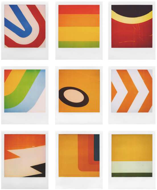
For the second photoshoot I continued to look at a John Baldessari, one of his main pieces of work was based on putting dots over peoples faces however I thought that type of piece was too popular so I decided to look at another piece of his which is not as popular, the piece below is called 'five oranges' which showed five different shades of orange.
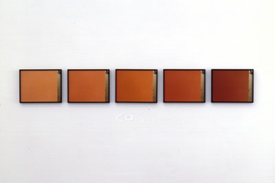
|
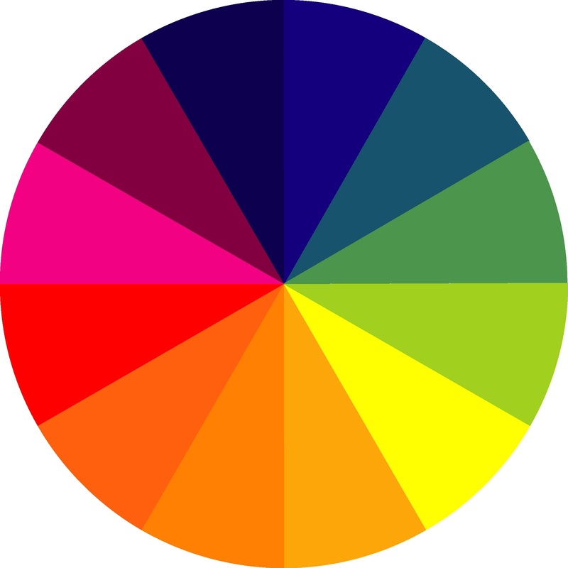
After looking at this piece I knew this would be something I would be interested in, I liked the idea of different tones and taking steps into the next colour, so my next step after looking at this piece of work was to look at a colour wheel to indicated the different colours and shades which would then lead to the next colour, the colour wheel to the right is the source I used.
|
|
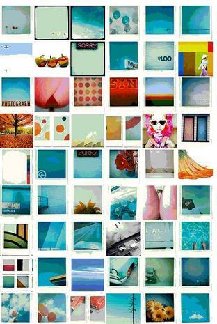
The next step was to create my own images based on colour and tone following the order of colours on the wheel, the photos that I took are shown below.


Grant Hamilton.
|
"Grant has a sharp eye for detail, form, and color, and his work shows the brilliance that exists in the everyday, hidden in plain sight."
|
|


my photos.


My additional final piece
For my additional final piece, I created a book online using blurb, I didn't want the book to be overly complicated as I wanted it to just show off the different photos or 'colour swatches' that I had created, each photo in the book had a little footer note saying what it was, I didn't want to have a tonne of writing on it as I wanted the viewer or readers entire attention to be on the photos as that is what the book is about, it had cost me about £28 to make, which compared to the other books I had made in the past, was really cheap, as I did make other books in the past, I had found this piece easy and simple to make as I knew exactly what to do, however, it usually wouldn't have been as time consuming as it was but the first two attempts of making the book weren't up to an adequate standard so I started again and again until I had gotten it right, most people at this stage would have lost patience and would have given up but, I was looking forward to receiving it in the post and seeing it finished, this is what motivated and encouraged me to get it finished because I really wanted to see the finished product and the sooner I got it finished, the sooner it would have got sent in the post.
